Lab No 5: Build an Interactive Dashboard
Overview
In this tutorial, you will configure a web map and use it to create an interactive dashboard for finding electric vehicle charging stations. This tutorial demonstrates how to create dashboards that can be applied to various geographic contexts, including examples relevant to Scotland such as monitoring renewable energy infrastructure, analyzing tourism patterns, or tracking public transport usage.
Estimated time of completion: 60 Minutes
Learning Objectives
By the end of this tutorial, you will be able to: - Configure web map pop-ups for dashboard use - Create and customize dashboard elements (headers, indicators, tables, and details) - Implement interactive selectors for data filtering - Configure actions to connect dashboard elements - Share dashboards within your organization
Part 1: Configure a Web Map
Step 1: Access the Base Map
- Open the Electric charging stations in Canada web map
- Click Sign In and sign in with your ArcGIS Online account
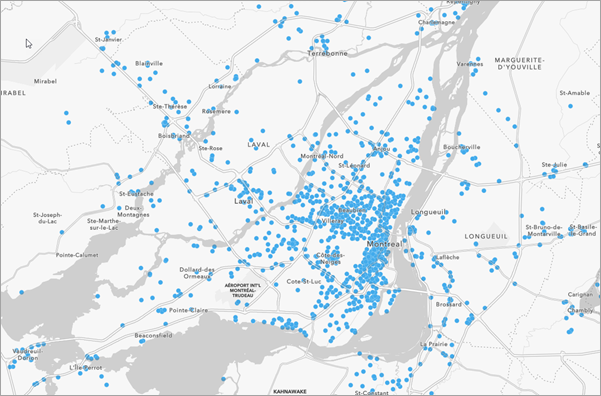
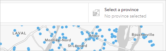
A map appears showing charging stations for electric vehicles across Canada. This type of infrastructure mapping is equally relevant for Scotland, where you might map: - Electric vehicle charging points across Scottish cities like Edinburgh, Glasgow, and Aberdeen - Renewable energy installations such as wind farms in the Highlands or solar installations in the Borders - Public transport hubs including bus stations, train stations, and ferry terminals
Step 2: Save Your Copy of the Map
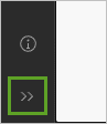
If necessary, on the Contents (dark) toolbar, at the bottom, click the Expand button
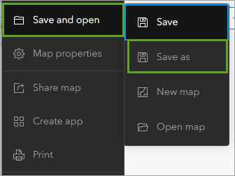
Click Save and open and choose Save as
In the Save map window, for Title, add your name or initials to the end of the existing text
Important: You cannot create two layers in an ArcGIS organization with the same name. Adding your initials ensures that other students can also complete this tutorial. For example, if your name is John Smith, you might title it “Electric charging stations in Canada - JS”
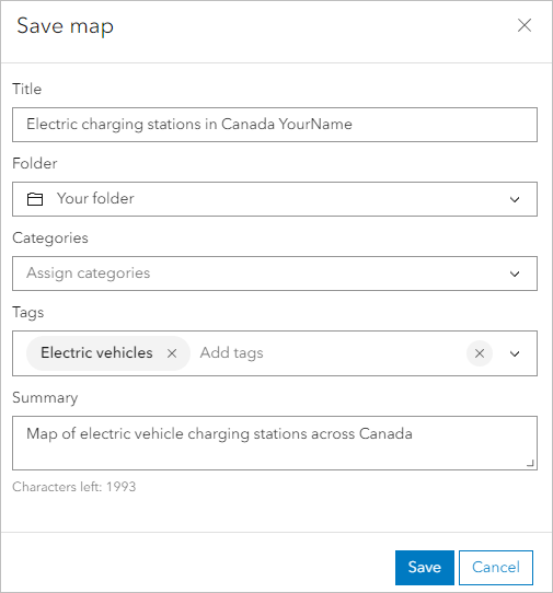
- Click Save
Step 3: Explore the Available Layers
- On the Contents toolbar, click Layers to open the Layers pane
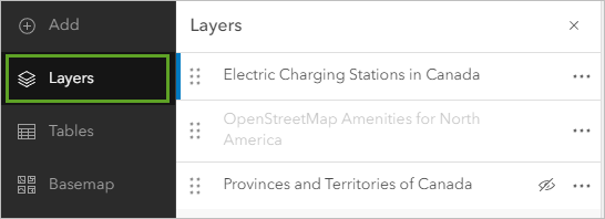
Three layers are available: - Electric Charging Stations: Blue dots representing charging locations with comprehensive attribute data - OpenStreetMap Amenities for North America: Context layer showing nearby facilities - Provinces and Territories of Canada: Boundary layer for spatial filtering
- Zoom in on the map until more symbols appear to see the OpenStreetMap amenities layer
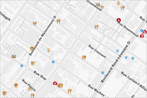
The amenities layer provides crucial context - since vehicle charging takes time, proximity to restaurants, shops, or libraries makes stations more attractive. In a Scottish context, this could include: - Proximity to tourist attractions (castles, distilleries, hiking trails) - Access to amenities (shops, cafes, accommodation) - Integration with public transport (bus stops, railway stations)
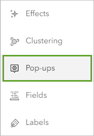
Step 4: Configure Pop-ups
- In the Layers pane, click the Electric Charging Stations layer to select it
- Expand the Settings (light) toolbar and click Pop-ups
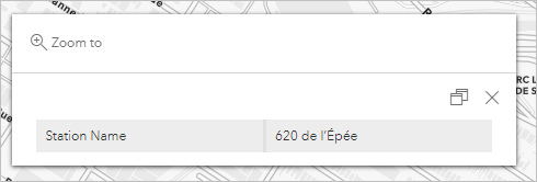
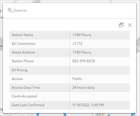
A sample pop-up appears over the map showing all available fields, many of which may be empty.
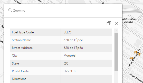
In the Pop-ups pane, click Title and confirm that the field is blank
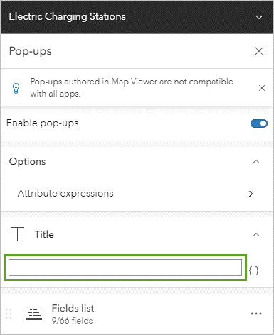
Click Fields list and click Select fields
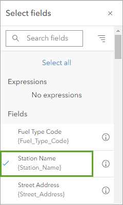
In the Select fields window, click Deselect all to clear all fields
Click the Station Name field to select it
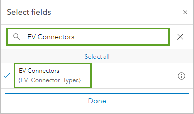
Click Search fields and type “EV Connectors”, then select the EV Connectors field
Search for and add the following fields:
- Street Address
- Station Phone
- EV Pricing
- Access
- Access Days Time
- Cards Accepted
- Date Last Confirmed
Click Done
Close the Pop-ups pane
Scottish Context Example: If creating a similar dashboard for Scotland, you might include fields such as: - Accessibility information (wheelchair access, disabled parking) - Pricing in GBP (including contactless payment options) - Network provider (ChargePlace Scotland, Polar, etc.) - Connection to renewable energy (wind or solar powered)
Part 2: Create a Dashboard from the Web Map
Step 1: Set Default View and Create Dashboard
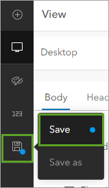
Click the Default map view button to return to the default map view
On the Contents toolbar, click Save and open and click Save
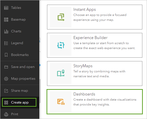
On the Contents toolbar, click Create app and click Dashboards
In the Create new dashboard window, type:
- Title: Vehicle charging stations
- Tags: electric vehicles (press Enter)
- Summary: Delete existing text and type “This dashboard allows you to find electric vehicle charging stations near you.”
Click Create dashboard
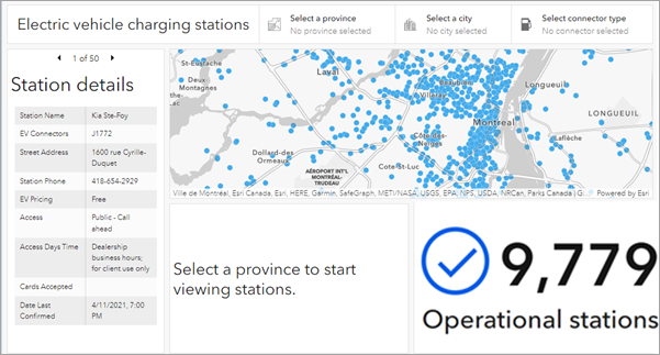
The new dashboard appears with your configured web map taking up the full space.
Part 3: Configure Dashboard Information Elements
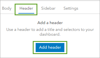
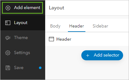
Step 1: Add a Header
At the bottom of the dashboard toolbar, click the Expand button
On the toolbar, click the View button to open the View pane
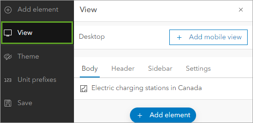
Click the Header tab and click Add header
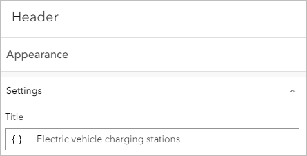
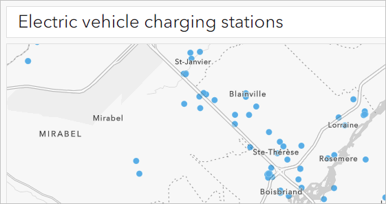
For Title, type “Electric vehicle charging stations”
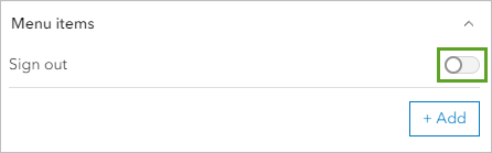
Expand the Menu links section and turn off Sign out
Click Done
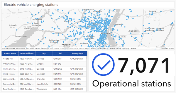
Step 2: Add an Indicator for Operational Stations
On the toolbar, click Add element
Below the map, click the Add button and click Indicator
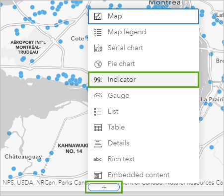
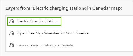
In the Select a layer window, click Electric Charging Stations
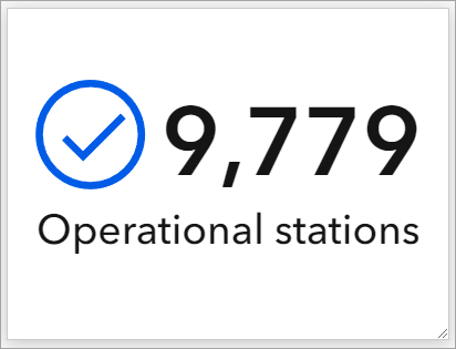
A preview of the indicator appears.

By default, an indicator’s value is the count of features in the data source. In this case, the value is the total number of operational stations across Canada. Since this layer receives updates daily, the preview may show a different number than the images in this tutorial.
The indicator has no context to explain the meaning of the number. You’ll add labels to explain its meaning.
Click the Indicator tab
For Bottom text, type “Operational stations”
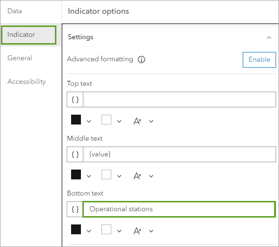
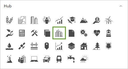
Click Add icon
Expand Miscellaneous and click the check mark in a circle icon
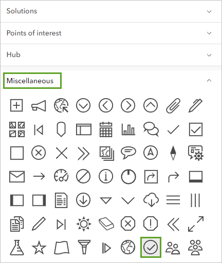
Click OK
Ensure Position is set to Left
Click the Fill color. For Hex, type
005ce6and press EnterExpand Value formatting and turn off Unit prefix
The preview now shows the exact number of stations instead of a rounded number.
Later, you will connect the indicator element to others on the dashboard, so the number can change based on filters that the user applies. For now, you’ll give the indicator element a meaningful name so it is easier for you to identify it later when you configure actions.
Click the General tab
For Name field, type “Operational stations indicator”
Click Done
Scottish Application: For a Scottish renewable energy dashboard, you might create indicators showing: - Active wind turbines in the Highlands - Solar installations generating power - Hydroelectric facilities operational - Carbon offset achieved through renewable sources
Step 3: Add a Table
On the toolbar, click Add element
Point to the indicator element and click the Add button on the left side
Click Table
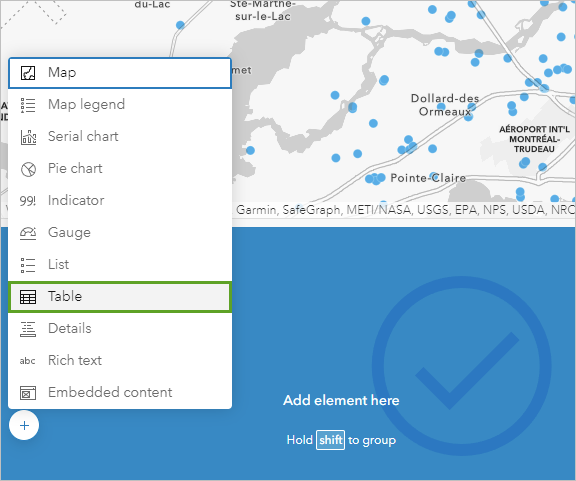
In the Select a layer window, click Electric Charging Stations
For Table type, choose Features
For Value fields, click Add field and choose Station_Name
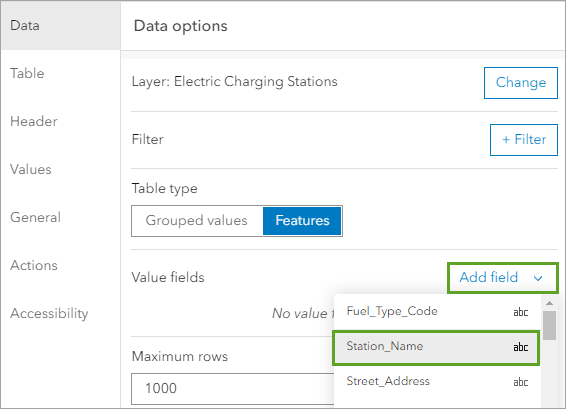
The Station Name field appears in the Value fields list and as the first column in the preview table.
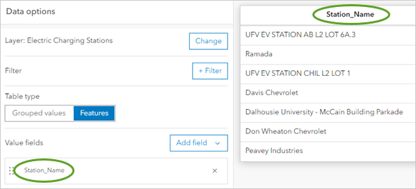
The Value fields section determines the columns of the table, with each row representing an individual feature.
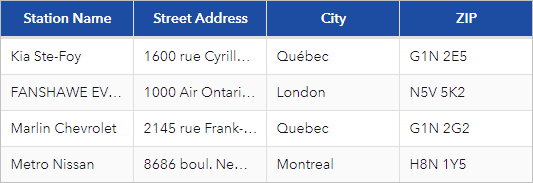
Add four more fields:
- Street_Address
- City
- ZIP
- Facility_Type
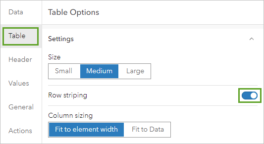
Click the Table tab and turn on Row striping
Click the Header tab
In the Label override section, remove underscores from labels (e.g., “Station Name”, “Street Address”, “Facility Type”)
Change Text color to
#ffffffand Background color to#004da8The table’s header changes to a dark blue color with white text.
The table’s visual area is now configured. Next, you will name the table so it is easier to identify later when you set up actions.
Click the General tab and set Name to “Station table”
Expand the No selection section and click Edit next to Label
Click Format and choose Heading 3
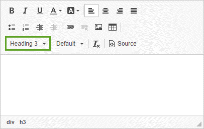
Type “Select a province to start viewing stations”
Click Done
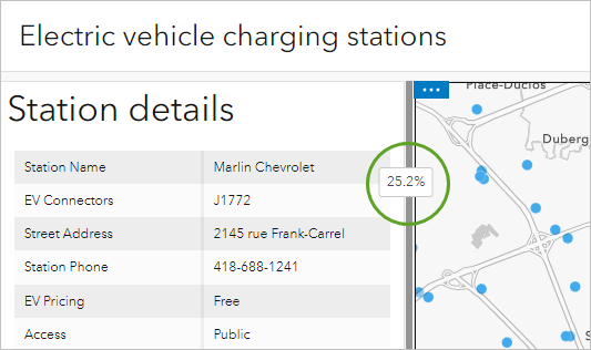
Step 4: Add a Details Element
On the toolbar, click Add element
Click the Add button on the left of the dashboard and click Details
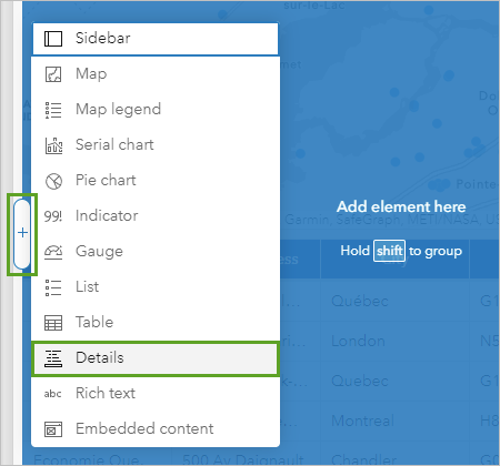
Choose Electric Charging Stations
Click the General tab and set Name to “Station details”
For Title, click Edit
Click Format, choose Heading 2, and type “Station details”
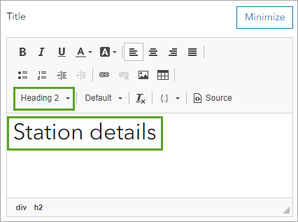
The title appears on the preview.
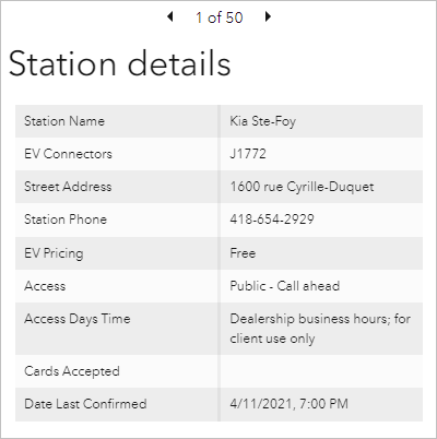
Expand No selection section, click Edit next to Label
Click Format, choose Heading 3, and type “Select a station to view details”
Click Done
Drag the right edge of the details pane until it takes up about 25% of the dashboard width
The dashboard is now configured with a map, a header, an indicator, a table, and a details element. Next, you’ll give users the ability to filter the data on the dashboard
Part 4: Configure Dashboard Selectors
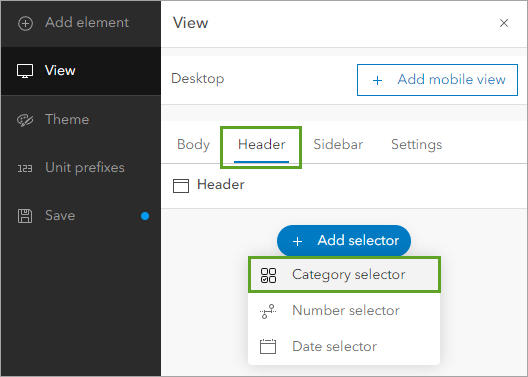
Step 1: Add a Province Selector
In the View pane, click the Header tab
Click Add selector and choose Category selector
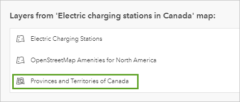
For Categories from, choose Features
Select Provinces and Territories of Canada
For Line item template, click Add field and choose PRENAME
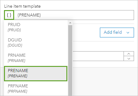
PRENAME is short for province English name. The preview updates to show a province name.
Click the Selector tab
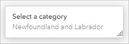
For Label, type “Select a province”
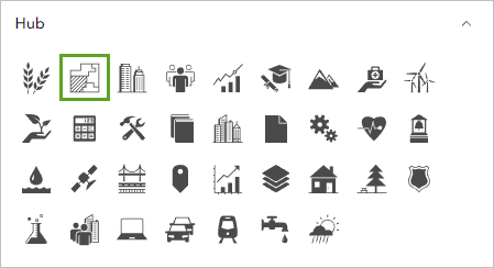
Click Add icon, expand Hub section, choose Boundaries icon, and click OK
Turn on Show search
Click the preview.
The list of provinces appears. At the top is a search bar that allows you to search the list with text.
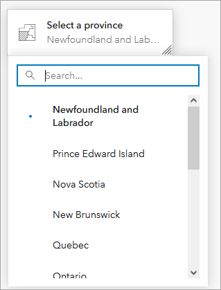
You’ll add an item to this list that allows users to select no province or territory.
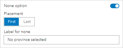
Turn on None option and set Label for none to “No province selected”
Expand General section and set Name to “Province selector”
Click Done
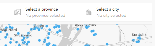
The province selector appears on the dashboard’s header, above the map.
Step 2: Add a City Selector
Click Add selector and choose Category selector
For Categories from, choose Grouped values
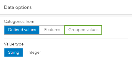
Choose Electric Charging Stations
For Category field, choose City
The City field is also added to the Sort by section. This will sort the cities alphabetically in the selector to make them easier to find.
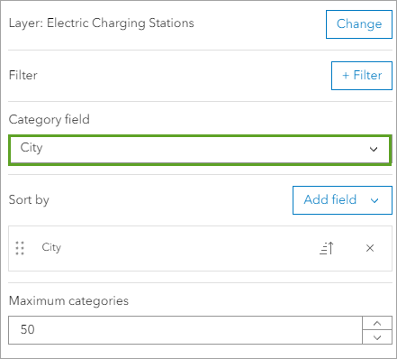
Maximum categories is set to 50, which means that only the first 50 cities will appear in the selector. There are more than 50 cities and towns in most provinces, so you will increase this limit.
For Maximum categories, type
350Click the Selector tab
For Label, type “Select a city”
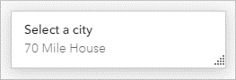
Click Add icon, expand Hub section, choose City icon, and click OK
For Selection, choose Multiple
Set Placeholder text to “No city selected”
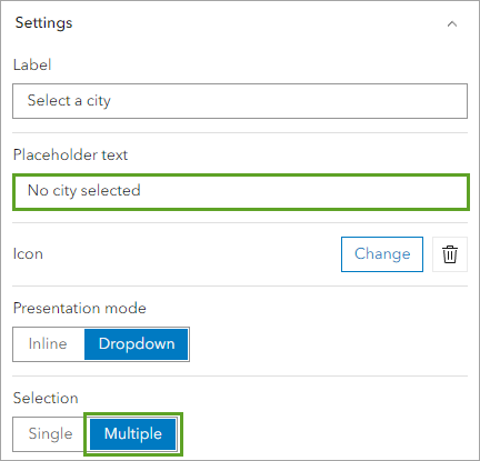
Turn on Show search and Show reset and select all
Click the preview to expand the list of cities.
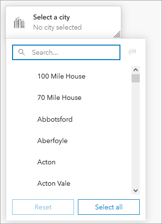
Reset and Select all buttons appear below the list. These tools can help users interact with longer lists more easily.
Expand General section and set Name to “City selector”
Click Done
The new selector appears on the dashboard’s header.
Step 3: Add a Connector Selector
Click Add selector and choose Category selector
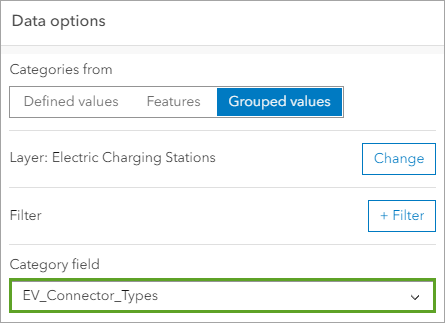
For Categories from, choose Grouped values
Choose Electric Charging Stations
For Category field, choose EV_Connector_Types
Click the Selector tab
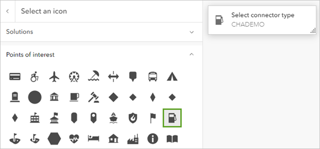
For Label, type “Select connector type”
Click Add icon, expand Points of interest section, choose fueling station icon, and click OK
For Selection, choose Multiple
Set Placeholder text to “No connector selected”
Turn on Show search and Show reset and select all
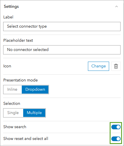
Expand General section and set Name to “Connector selector”
Click Done
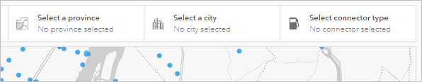
All three of the selectors are now configured. However, they can’t yet be used to filter data on the dashboard. Next, you’ll configure actions to connect all of the dashboard’s elements so users can tailor the dashboard to their needs.
Scottish Context Example: For a Scottish tourism dashboard, selectors might include: - Council areas (Highland, Fife, Glasgow City, etc.) - Attraction types (Castles, Distilleries, Museums, Natural sites) - Accessibility features (Wheelchair accessible, Family-friendly, Dog-friendly) - Seasonal availability (Year-round, Summer only, Winter sports)
Part 5: Configure Actions
Step 1: Configure Province Selector Actions
In the View pane, Header tab, point to Province selector
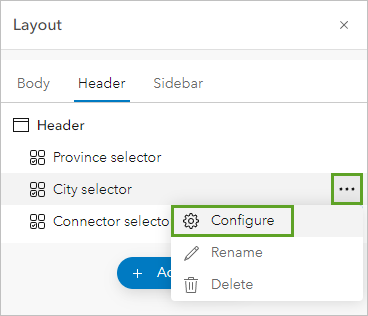
Click the options button and click Configure
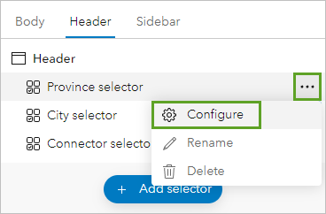
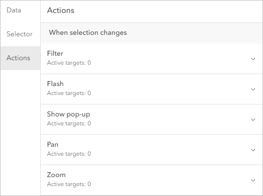
Click the Actions tab
You can configure a Filter, Flash, Show pop-up, Pan, or Zoom action to occur when a new province is selected.
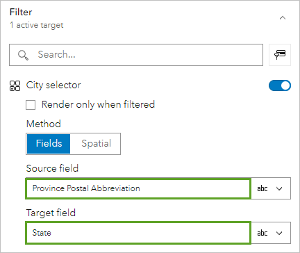
The first action that you’ll configure is a filter action. When users select a province in the province selector, it will filter the city selector to only show cities within that province.
Expand the Filter section
Turn on City selector and set:
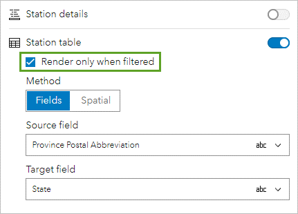
Source field: Province Postal Abbreviation
Target field: State
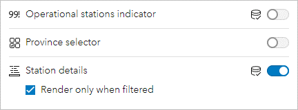
Turn on filter actions for Electric Charging Stations, Operational stations indicator, and Station table
For each, set Source field to Province Postal Abbreviation and Target field to State
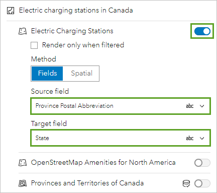
For Station table, check Render only when filtered
You’ll add one more action to the province selector, to make the map zoom to the selected province.
Expand Zoom section and turn on Electric charging stations in Canada
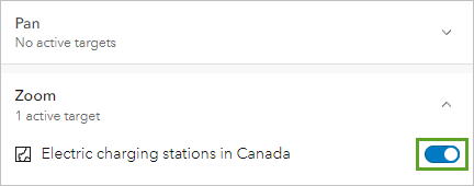
Click Done
The dashboard looks the same as before, except that the table has been replaced by a message.
You’ll test that the actions you configured are working as expected.
Step 2: Test Province Selector
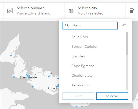
Click Select a province and choose Prince Edward Island
Observe how the map zooms, table populates, and indicator updates
Click Select a city to see only relevant cities listed
Step 3: Configure City and Connector Selector Actions
- Configure City selector:
Point to City selector, click options, and Configure
Click Actions tab, expand Filter section
Turn on Connector selector, Electric Charging Stations, Operational stations indicator, and Station table
Click Done
- Configure Connector selector:
Point to Connector selector, click options, and Configure
Click Actions tab, expand Filter section
Turn on Electric Charging Stations, Operational stations indicator, and Station table
You don’t need to define matching fields this time because all of the connected elements are based on the same layer: Electric charging stations in Canada.
Click Done
In the Layout pane, point to Connector selector, click the options button, and click Configure.
Click the Actions tab and expand the Filter section.
Turn on Electric Charging Stations, Operational stations indicator, and Station table.
Click Done.
You’ll test that the actions behave as expected together.
If necessary, on the header, click Select a province and choose Prince Edward Island.
Click Select a city and choose Charlottetown.
The map, table, and indicator all update to show fewer stations.
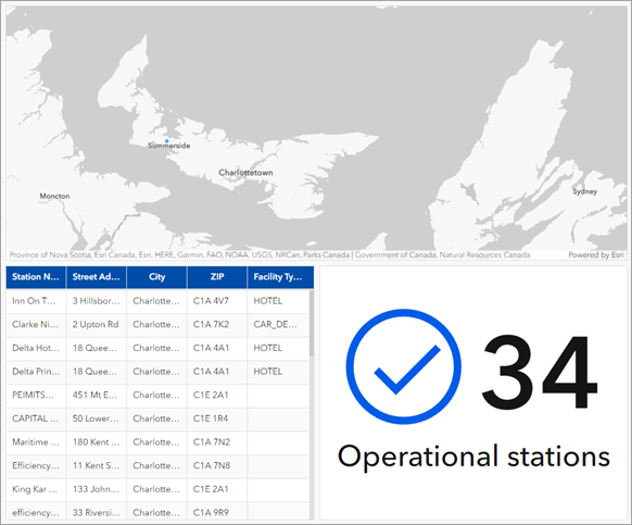
On the header, click Select connector type.
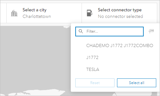
The list has fewer options than before.
In the connector selector, click TESLA.
The map, table, and indicator all update to show fewer stations.
Step 4: Configure Table Actions
The last actions you will configure are on the table. The table only populates once a province is selected on the header. Similarly, you will ensure that the details element only populates when a station is selected in the table. Otherwise, viewers will see details for stations that are probably not relevant to them. When there is no selection on the table, the message you configured earlier will display.
In the View pane, click the Body tab
Point to Station table, click options, and Configure
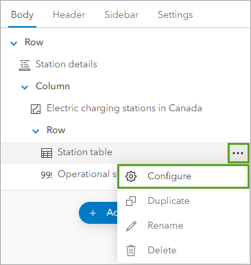
Click Actions tab, expand Filter section
Turn on Station details and check Render only when filtered
Expand Flash section and turn on Electric charging stations in Canada
Expand Zoom section and turn on Electric charging stations in Canada
Click Done
On the dashboard, click any row in the table.
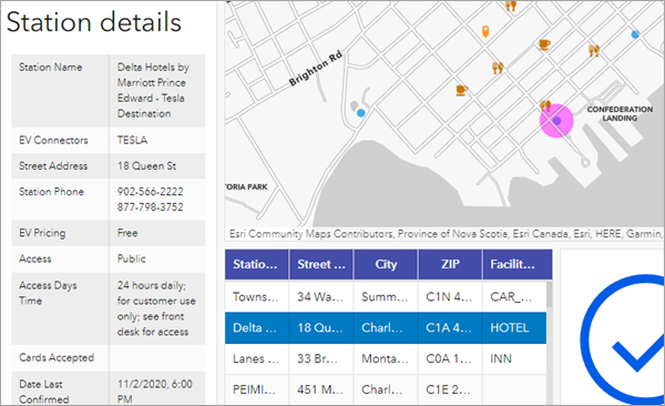
Step 5: Test Complete Functionality
- Select Prince Edward Island from province selector
- Select Charlottetown from city selector
- Select TESLA from connector selector
- Click any row in the table to see details populate and map zoom/flash
Part 6: Share the Dashboard
Step 1: Save and Access Dashboard Settings
On the dashboard toolbar, click Save and click Save
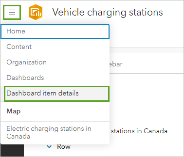
Next to the dashboard title, click the menu button and click Dashboard item details
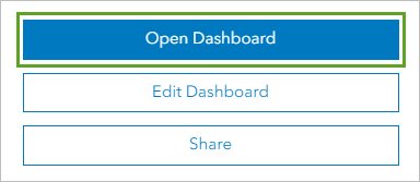
Click Open Dashboard to test in a new browser tab
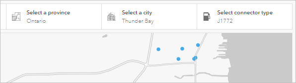
Test the dashboard functionality (e.g., find J1772 charging stations in Thunder Bay, Ontario)
Final Steps:
Well Done! You have now completed all the steps for this lab. Before moving on, make sure to:
Take one screenshot of the final map. Ensuring your full screen is visible, including the date and time. This screenshot will be required for your report ( see all the instructions in the handbook). Dashboard fully loaded - showing all elements working - Demonstration of functionality - show the dashboard with: - A province selected - A city selected - A connector type selected - Station details displayed - Table populated with filtered results.
For the Part B of this lab in your report. Replicate the process independently by applying the same skills you practised in this lab, but using spatial data from Scotland or the UK.
In the original lab, you have created a operational dashboard. For your independent spatial analysis, you can choose a different theme and dataset (e.g. healthcare access, education, environmental risk), as long as you also:
Use again ArcGIS Online Dashboards using your university credentials. Meet and work with your classmate to define which account want to use . You must only report one independent analysis results.
Apply the same techniques learned in this lab., and create another operational dashboard app, to represent the thematic of your preference.
Include the screenshot of the new dashboard created with a clear purpose relevant to a real-world issue in Scotland or the UK. Ensuring your full screen is visible, including the date and time. This screenshot will be required for your report. As you did for the first screenshot, make sure you the dashboard is fully loaded - showing all elements working - demonstrate the functionality - show the dashboard with: - List section, items details displayed - table populated with filtered results. Take a full screen screenshot (not just browser window) 5. Include this screenshot with your report (see the instructions in the handbook)
This additional task is an opportunity to improve your technical skills, explore new datasets, and demonstrate your ability to adapt spatial analysis methods to new contexts.
Scottish Context Examples:
Here are some examples of potential operational dashboards you could create for the Scottish contexts:
- Renewable energy monitoring (wind farms, solar installations)
- Tourism infrastructure (attractions, accommodation, transport links)
- Public transport optimization (bus routes, train connections, ferry services)
- Environmental monitoring (air quality, weather stations, flood warnings)
- Economic development (business locations, employment centers, investment zones)
Tutorial inspired from https://learn.arcgis.com/en/projects/build-an-interactive-dashboard/