Lab No 1: Getting Started with ArcGIS Online
Overview
By the end of this lab, students will be able to: - Navigate and use the ArcGIS Online interface - Add and configure data layers from ArcGIS Living Atlas - Style demographic data using appropriate symbology - Filter data to focus on specific geographic areas - Apply visual effects to emphasize important data patterns - Create a professional web map for emergency planning purposes
Estimated time of completion: 45 Minutes
Mapping Census Data for Emergency Planning
In this lab, you will create a web map to identify areas that may need additional evacuation assistance during emergencies. You will work with census data to identify households with limited vehicle access, which is crucial information for emergency planning and resource allocation.
Part 1: Start with a Map
Step 1: Access ArcGIS Online
Sign in to ArcGISOnline, using your University Credentials. (see here to learn how to log in into ArcGIS)
On the ribbon, click the Map tab

A default web map appears. Your map’s appearance varies based on your account or organizational settings and your browser window size. It may show the United States, the world, or another extent.
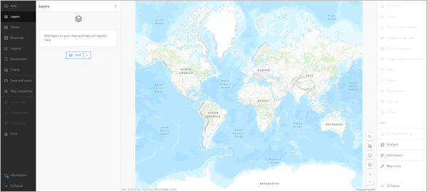
The only layer on the map is the basemap, which provides geographic context such as water bodies and political boundaries. The default basemap is Topographic, but your map may have a different basemap depending on your organization’s settings.
On either side of the map are the toolbars: - Contents (dark) toolbar: Allows you to manage and view map contents - Settings (light) toolbar: Provides tools and options for configuring and interacting with map layers - Layers pane: Lists the data you add to the map
Step 2: Navigate to Your Area of Interest
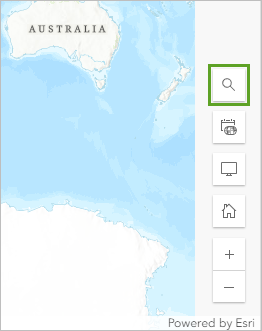
On the map, at the bottom corner, click the Search button
In the search box, type
Houstonand choose Houston, TX, USA from the list of suggested locations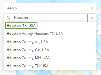
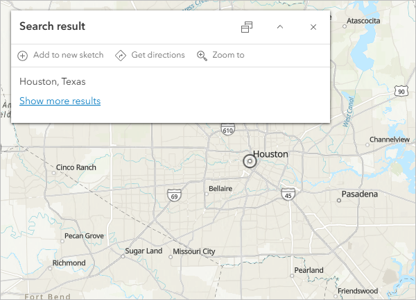
Close the Search result window when the map zooms to your location
Part 2: Add a Layer
Layers contain geographic data that can be displayed on your map. To determine areas that may need evacuation assistance, you’ll add a layer containing demographic data by census tract.
In the Layers pane, click Add
In the Add layer pane, click My content and choose Living Atlas
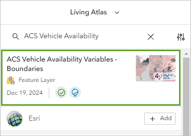
In the search box, type or paste
ACS Vehicle AvailabilityClick the ACS Vehicle Availability Variables - Boundaries result
In the item pane, expand the Description section and read about the layer
Close the item pane
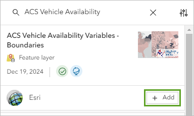
For the ACS Vehicle Availability Variables - Boundaries layer, click Add
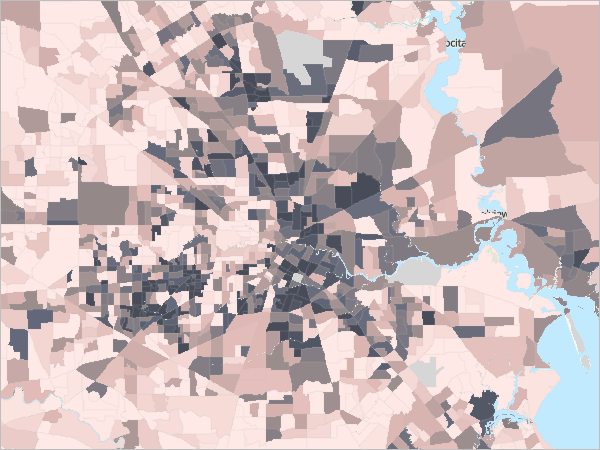
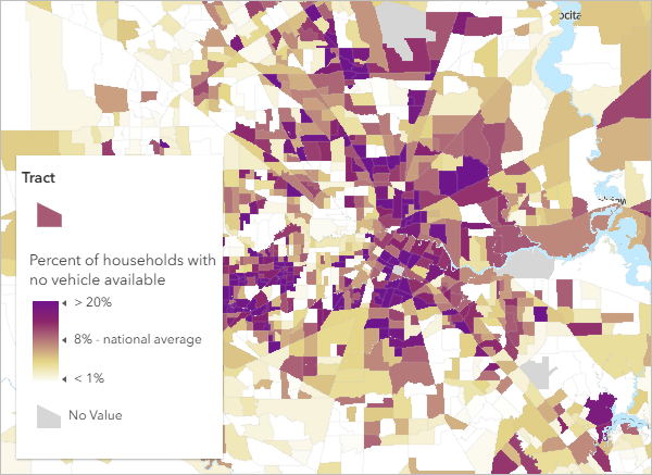
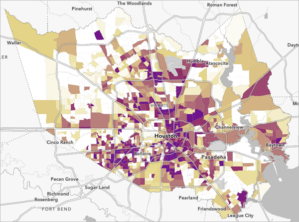
The layer is added to the map, styled to show the percentage of households with no vehicle available in each census tract. Darker areas have higher percentages of households without vehicle access.
Step 1: Manage Layer Groups
At the top of the Add layer pane, click the Back button

In the Layers pane, expand the ACS Vehicle Availability Variables - Boundaries group
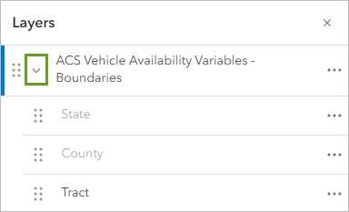
Drag the ==Tract== layer above the group
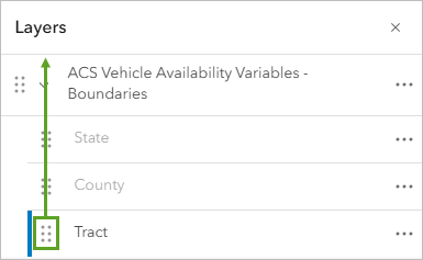
For the group, click the Options button and choose Remove
Part 3: Style Demographic Data
Step 1: Select Styling Options
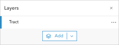
In the Layers pane, click the Tract layer to select it
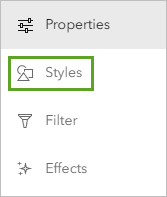
On the Settings toolbar, click the Styles button
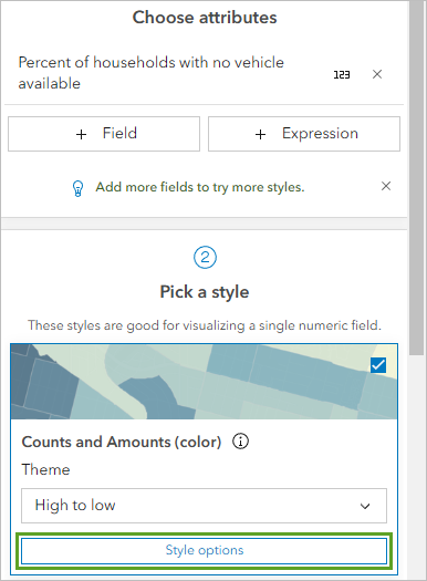
In the Styles pane, ensure ==Percent of households with no vehicle available== is selected
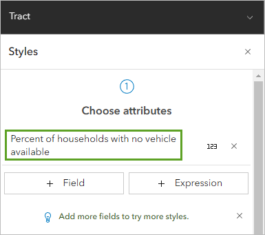
The list of available styles is determined by the data type. In this case, the options are for numeric data. The map shows the Counts and Amounts (color) style. The colors are based on the High to low theme. This style symbolizes each census tract with a different color based on the percentage of households without a vehicle. Census tracts with the lowest values have a light color, while those with the highest values have a dark color.
Step 2: Customize Symbol Style
For Pick a style, on the Counts and Amounts (color) card, click Style options
For Symbol style, click the color ramp
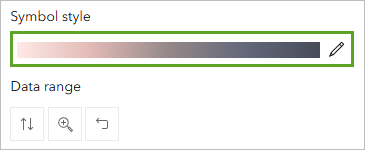
In the Symbol style window, for Colors, click the color ramp
In the Ramp window, choose Purple 18
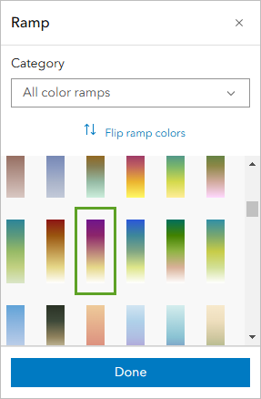
The new color ramp is applied to the map. Census tracts with high percentages are displayed in dark purple while low percentages are white.
If needed, click Flip ramp colors so high percentages show in dark purple
Click Done to close all style windows
Step 3: Rename the Layer
In the Layers pane, for the layer, click the Options button and choose Rename
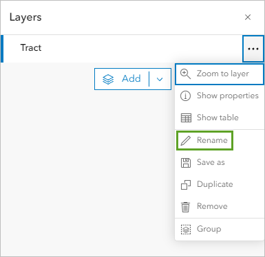
For Title, type Percent of Households with No Vehicle Access
Click OK
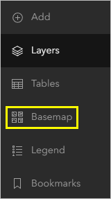
Part 4: Change the Basemap
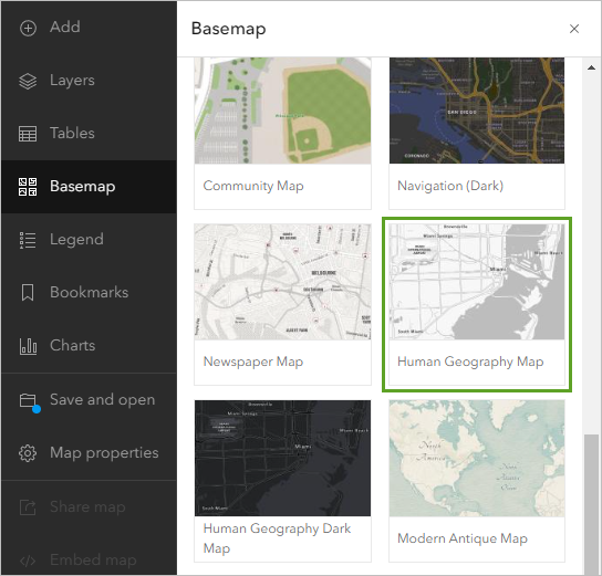
On the Contents toolbar, click Basemap
In the Basemap pane, find and choose Human Geography Map
On the Contents toolbar, click Layers to return to the Layers pane
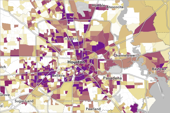
The new basemap shows labels and contextual information over the census data.
Part 5: Filter the Map
Step 1: Create a Geographic Filter
Ensure the Percent of Households with No Vehicle Access layer is selected
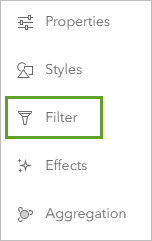
In the Settings pane, click Filter
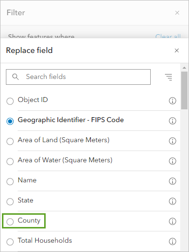
In the Filter pane, click Add new
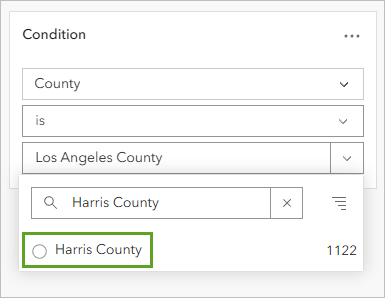
Under Condition, click the first box and choose County
Leave the operator as is
For the third box, click the drop-down arrow, type Harris County and select it
Click Save to apply the filter
Part 6: Emphasize the Top Tracts
Step 1: Examine the Attribute Table
For the layer, click the Options button and choose Show table
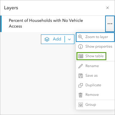
The layer’s attribute table appears. The attribute table is a way of viewing all of the attributes that exist for each feature. Each row in the table represents a feature (in this case, a census tract area). The columns, or fields, provide information about the census tract features, such as the County attribute that you used to filter the data earlier.
The top of the table indicates that there are 1,122 census tracts in Harris County.
Scroll right to find the Percent of households with no vehicle available column
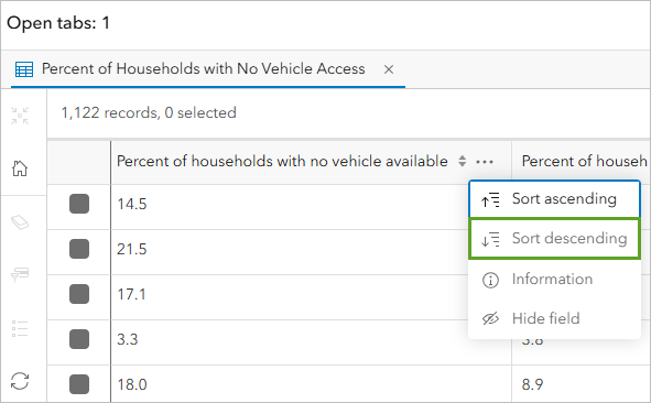
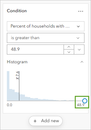
The table is sorted so that the Percent of households with no vehicle available field shows tracts in order of highest to lowest values. The highest value is 48.9 percent.
Click the Menu button for this column and choose Sort descending
Identify the 10 highest values in the table
Close the table
Step 2: Apply Visual Effects
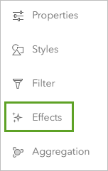
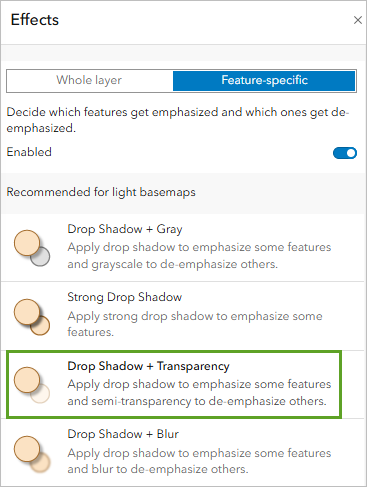
In the Settings pane, click the Effects button
In the Effects pane, click Feature-specific
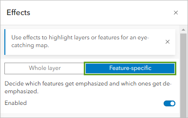
Click the Drop Shadow + Transparency effect
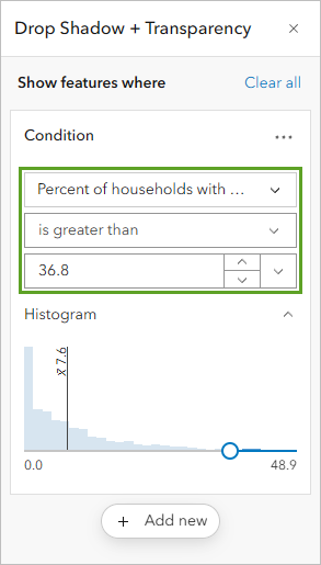
In the Drop Shadow + Transparency pane, drag the histogram slider to the 48.9 label. This will adjust the histogram slider to emphasize the top 10 tracts
Modify the logical expression to highlight areas above your identified threshold. Change the logical expression to read Percent of households with no vehicle available is greater than 36.8.
Close the effects windows
Part 7: Final Documentation and Submission
Step 1: Save Your Map
On the Contents toolbar, click Save and open and choose Save as
For Title, type: Census tracts in Houston with low vehicle access
For Tags, add the following (press Enter after each):
- Hurricanes
- Evacuation Assistance
- Houston
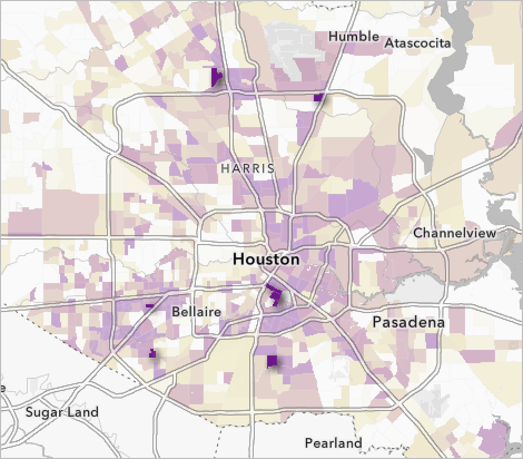
For Summary, type: This map shows census tracts in Houston, Texas, that have many households without access to a vehicle. These areas may need to be considered for evacuation assistance in case of a hurricane or other natural disaster.
Click Save
The map is saved. It now appears in your account’s content. You can access your content by clicking the options button next to the map’s name and choosing Content. For now, you’ll set the sharing permissions.
By default, your content is private and only visible to you and your organization’s administrator. You can share content to different groups of viewers depending on the level of privacy you want to maintain and the content’s audience and purpose. For example, if you choose to share it with your organization, only users with accounts in the same organization ( e.g The University of St Andrews) as you can access your content.
Final Steps:
Well Done! You have now completed all the steps for this lab, where you (in theory) created your first Web Map using ArcGIS Online. Before moving on, make sure to:
Take a screenshot of your final web map, ensuring your full screen is visible, including the date and time. This screenshot will be required for your report ( see all the instructions in the handbook)
For the Part B of this lab in your report. Replicate the process independently by applying the same skills you practised in this lab, but using spatial data from Scotland or the UK (See the Data sources sections for a comprehensive list of data sources).
In the original lab, you created a web map using census data for emergency planning in the U.S. For your independent spatial analysis, you can choose a different theme and dataset (e.g. healthcare access, education, environmental risk), as long as you also:
Use again ArcGIS Online using your university credentials. Meet and work with your classmate to define which account want to use. You must only report one independent analysis results.
Apply the same techniques learned in this lab (e.g. adding layers, symbolising data, filtering, configuring pop-ups, etc).
And create a web map with a clear purpose relevant to a real-world issue in Scotland or the UK.
This additional task is an opportunity to deepen your technical skills, explore new datasets, and demonstrate your ability to adapt spatial analysis methods to new contexts.
Additional Resources
ACS Vehicle Availability Variables - Boundaries data is from the American Community Survey.
Topographic map sources: Esri, TomTom, Garmin, FAO, NOAA, USGS, OpenStreetMap contributors, and the GIS User Community
Human Geography Map sources: Esri, TomTom, Garmin, FAO, NOAA, USGS, OpenStreetMap contributors, and the GIS User Community
This tutorial is inspired from ArcGIS Online Learning resources available at https://learn.arcgis.com/en/projects/get-started-with-arcgis-online/